
MRD Mattison Drive
I am so excited to share the #mrdmattisondrive kitchen project with you today! Let me start by saying that the befores and afters here are fairly mind blowing but I promise it’s the same space! The overall approach to this design was to create a timeless and elegant look that felt elevated, cozy and approachable. Our clients are a young family with a traditional design slant and they ended up with a kitchen that truly reflects their aesthetic. This renovation was a dream to work on with clients who have amazing taste and a contractor who’s on their game. A big thank you to all who were involved!

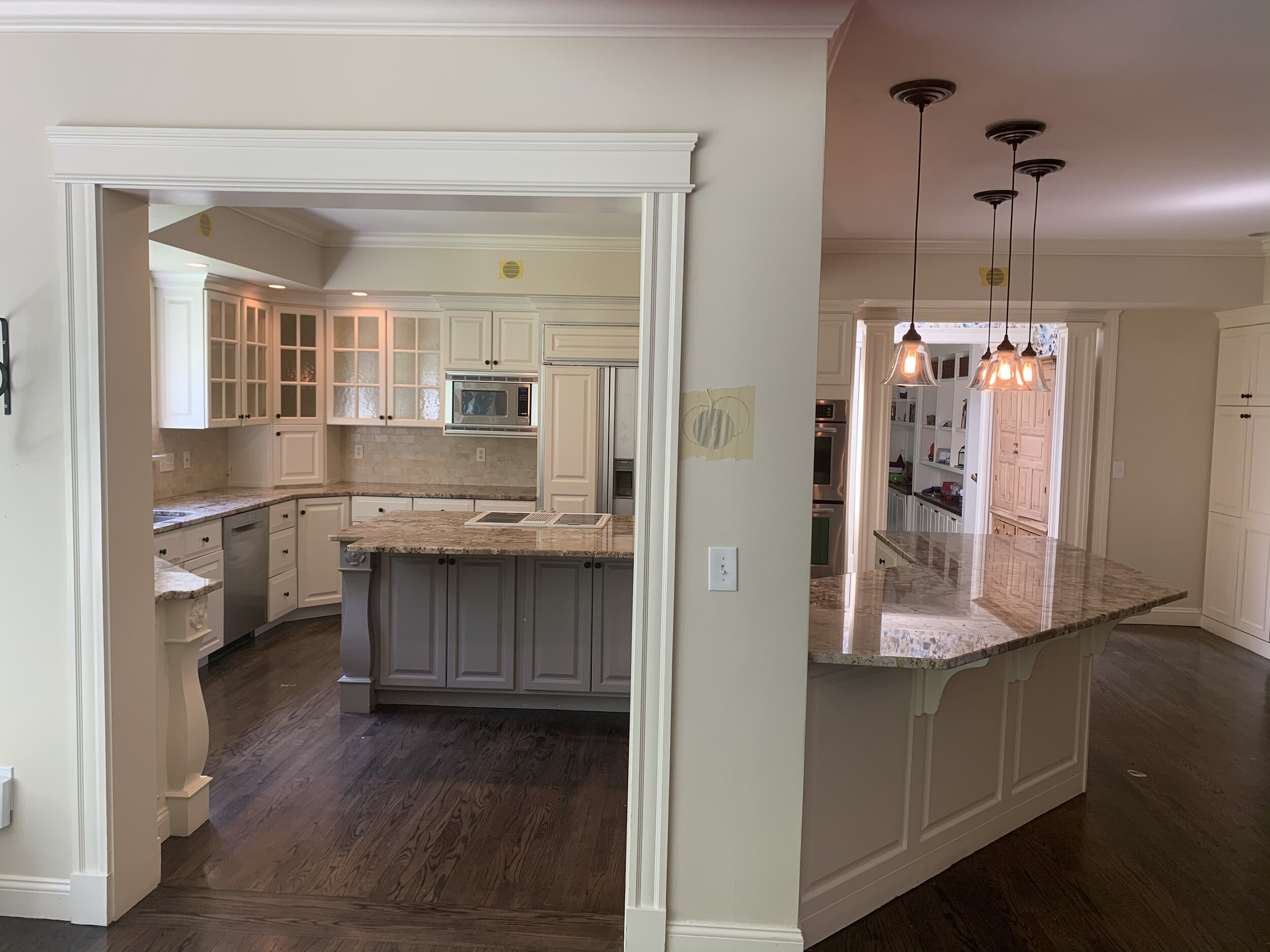
Let’s get into some before shots! As you can see, it was a 90s dream (nightmare?) with LOTS of angles, an unnecessary soffit, and dated finishes.
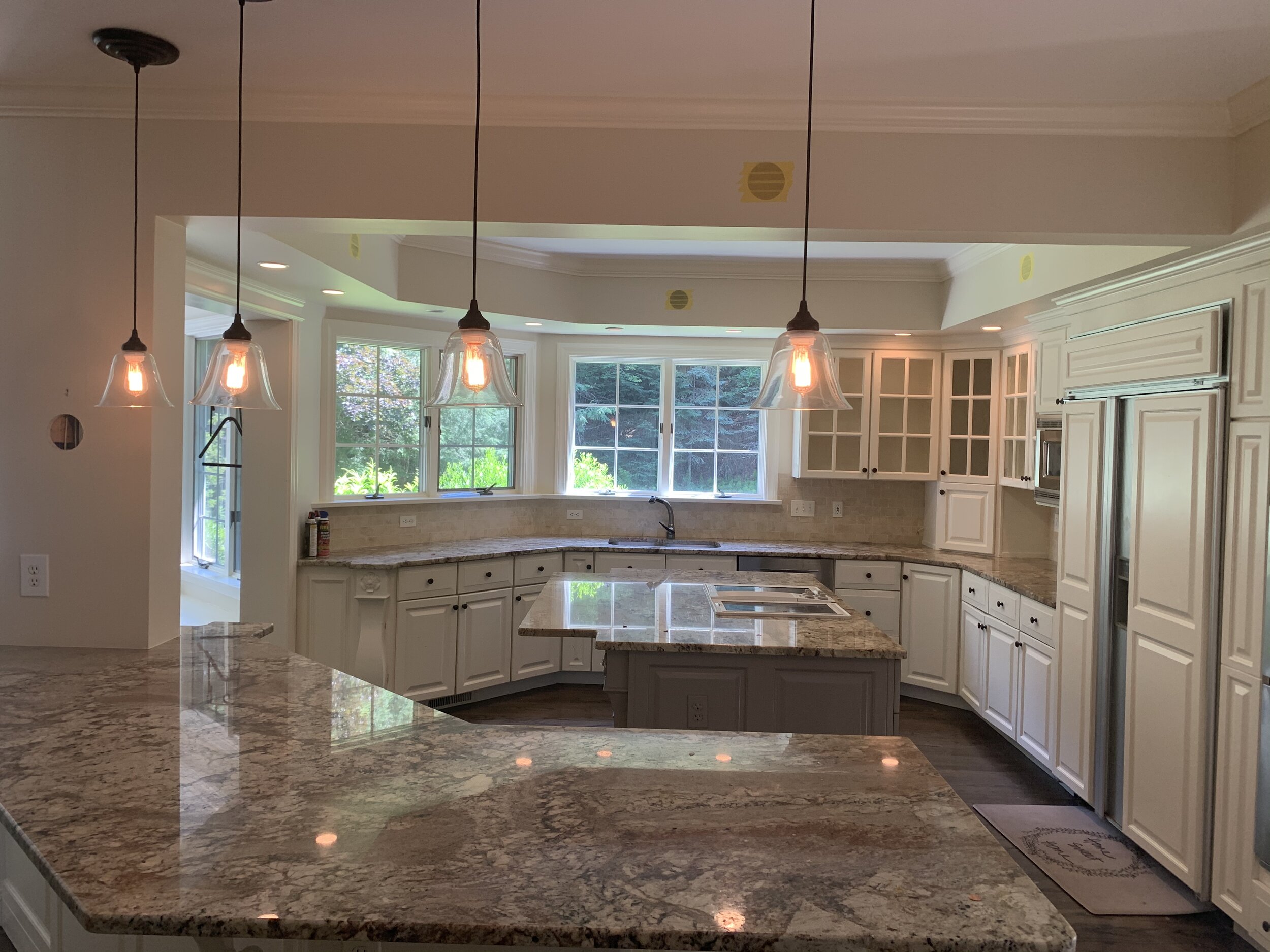


The first item that our clients chose was a stainless and brass La Canche range. The range was important because it dictated a lot of the layout due to the size (55”). We went through many iterations of layouts - from double islands to the refrigerator in three different places - before landing on this plan. Symmetry and balance were key to the design but the appliances always play a big role too.
From a construction perspective, the biggest change was flattening the back wall. It’s a little hard to see but the cabinets on the sink wall curved around before. Once we determined that we could flatten that V shape that jutted into the room and create a straight line of cabinetry on the sink wall, it opened the possibility of a peninsula with counter seating. The only major structural issue that we had to contend with was one column that couldn’t move (without a giant beam and crane). It made for some creative solutions around how to incorporate it as seamlessly as possible and in the end it doesn’t feel like an afterthought which was a real win!

To help the column feel integrated, we incorporated it into the peninsula and added a lower cabinet on the other side. This gave us an opportunity for a material change on the counter and since our clients love walnut, that’s what we went with! I love how it added depth and warmth to the space. Plus on the back side, the cabinet houses a printer so it added function too.
On the sink wall we added a new, longer triple window to replace the awkwardly high windows that were there previously. To create that classic, cozy look, we really focused on the details like lighting that you wouldn’t normally find in a kitchen and a marble backsplash (imperial danby marble) that created a beautiful backdrop for accessories. The walnut drip edge under the sink is a favorite detail of mine and when you have the space, why not have two dishwashers flanking the sink!


As I mentioned, symmetry was very important to our clients and we spent a lot of time perfecting the range wall to achieve that balanced look. Since we didn’t have upper cabinets on the sink wall, we ended up with wider cabinet on the far left of the range. To make it feel unique, we used glass doors and cremone bolts that really took it up a notch.


The hood design is simple but beautiful and lets the range stand out. The tile behind the range was a happy accident. We had originally planned for a full height slab backsplash but the stoneyard didn’t reserve enough slabs so in a last minute swap, we used this gorgeous hand cut zellige tile which in the end we liked better than the original plan! It brought more character and a bit of imperfection.
I love the glass pendants - they don’t obstruct any views but they still make a statement on their own. We chose English hardware in unlacquered brass which patinas to such a beautiful color.

The desk area in the old kitchen was definitely nice but it had to be reworked with the pantry and 48” refrigerator being relocated to that space. We carved out a small desk space that works well for the mom and brought over more of that walnut to tie everything together.

We also took the opportunity to redo the kitchen table area with a new rug, lighting, and a 72” round table that was already in our client’s family and happened to be perfect for this spot.

So there you have it! This is definitely a special kitchen and I’m so glad to have helped it come to life!
Photography: Greg Premru
Builder: Platt Builders
Selected sources:
Wall color: BM Bone White
Counters: Imperial Danby marble
Range: La Canche 55”
Sink & faucet: Rohl
Pear painting: Powers Gallery